Ask a teacher what influences learning and you’ll get a variety of responses — primarily around teaching methods, curriculum and outside influences. Without a doubt, it’s highly unlikely that you’ll hear color as a response, much less the color of furniture.
While the impact of color is often overlooked, color is an inseparable part of our everyday lives.
It’s inherent in everything we see and do and studies indicate that it plays a role in emotion, productivity, communication and learning.
While the research is varied it is conclusive; the use of color can have a significant impact on emotion, which can ultimately influence an individual’s working and studying. In fact, studies on emotion and color show a direct link between color and positive and negative feelings. The use of color also helps define a room’s purpose whether it is for quiet study, collaboration or relaxation.
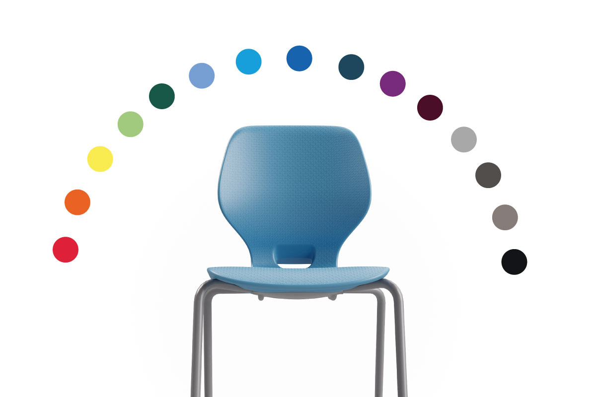
The impact color has on a room and its occupants is undisputed. For decades, interior designers have leveraged color to set a room’s purpose or mood. While often ignored in the classroom, color remains an important element to consider in any environment. The use of color can be broad, such as a room’s wall color, or a select accent, such as chairs or tables, depending on the intended effect. With a few exceptions, the use of color within schools has been limited to functionality.
According to Ohio-based interior designer, Elizabeth Stout, color in school room design is rarely a consideration, except for its relation to functionality. Typically, a school will have a neutral wall color and use the school’s colors as an occasional accent.
“Furniture is usually chosen based on functionality, ergonomics and durability,” Stout said. “Schools generally never choose light-colored furniture because it makes dirt easy to spot. Additionally, in some elementary schools, chair color is dictated by size.”
However, furniture color is an important part of the school. Similar to wall color, the pieces used in different spaces require different color usage to facilitate learning. While there is no one-size-fits-all approach to room and furniture color selection, looking at the effects of color on emotion and relating that to the purpose of the learning space can help guide the color choices – on walls, on floors, and even on furniture.
The following are some practical guidelines for incorporating color into three different spaces in a school’s interior, with a specific focus on furnishings.
The Classroom
Classrooms are used for a variety of purposes, but the main intent is active learning. For this reason, color in a classroom environment should maximize information retention and stimulate participation.
The key to creating an environment conducive to learning in a classroom is to not over-stimulate learners. Overstimulation is often cause by large amounts of bright colors, especially reds and oranges. Calmness, relaxation, happiness and comfort are feelings elicited by colors such as green and blue.

While it is best to have a calming and neutral color on the walls, furniture can add a splash of color to an otherwise dull classroom. Since color is not used in large amounts on furniture, it does not have the same affect as bright colors on walls. Select yellow furniture to elicit feelings of liveliness, energy, happiness and excitement. Red and orange in small quantities can also demand attention and attract learners’ attention to detail – a great way to lead students to a certain part of the room for an engaging activity.
If the intent is to match all elements of the room, use furniture colors that are similar to wall colors focusing on the calming greens and blues.
The one exception to color in the classroom is with younger children, who unlike older children, thrive in a bright-colored environment. In this instance, bright colors can be used on the walls and in the furniture. It can also be used to help children understand how certain areas of a room are used. For example, the blue chairs in the corner may be used as a reading and relaxation area, while the red table may be a free-play space.
Libraries
Libraries are similar to classrooms in many ways. They are multi-purpose, are an extended learning environment and require careful attention to color selection.
Color in a library setting should be used to align emotions and behaviors with the purpose of the space. Since different areas of a library are intended for different activities, have fun experimenting with color. Take a reading area, for example. As an extension of the learning environment, reading areas are intended to be calming and relaxing allowing learners to reflect. In this instance, matching calming wall colors – like greens and blues – with furniture colors maximizes the effects of color in this space.

In contrast, if an area is used for lounging and conversing, color can provide excitement. Consider using a more neutral wall color and experimenting with furniture color by using bright-colored cushions, fixed colors on lounging chairs or vibrant accents on tables or shelving. Color selections might include deep reds, oranges and yellows, or pastels in any color combination.
Common Areas
Unlike classrooms and libraries, common areas, such as entry ways and lunch rooms, are more informal and welcome conversation, excitement and play. The color choices in a common area are limitless, but still should reflect the purpose of the area.
The front entry way is a great example of a common area, and is usually the first space people see when they enter a building. Typical furniture found in entry ways can include bench seating or small tables conducive to last-minute studying or midday chats. As a common gathering place for students before school, after school and between classes, entry ways welcome fun and conversation. The furniture used in these spaces should reflect this excitement through bold, energetic colors. The front entry way is often a good place to incorporate school colors into the furniture to welcome visitors with the school’s spirit.

Lunch rooms are also an area that allow for free time, and should also be energetic and welcoming. Feel free to use school colors on the walls, but use furniture to compliment. If school colors are bright, use furniture in similar tones. If the wall colors are muted or neutral, use bursts of colorful furniture to add life to the space.
Give Colorful Furniture a Try
Through both research and practical application, it is clear that color can have an effect on mood, emotion, and productivity, which ultimately influences student success. While there is no one-size-fits-approach to the use of color, consider letting the purpose of the room guide the color scheme selection. With a little bit of thought and planning – and access the right furniture company – finding furniture that meets the color needs of any space can be done with ease.
Sidebar:
According to a 2004 study by Kaya & Epps titled Relationship between color and emotion: a study of college students found the following:
- Green is associated with relaxation and calmness, followed by happiness, comfort, peace, hope and excitement.
- Yellow was generally said to be lively and energetic eliciting positive emotions associated with the sun and summertime.
- Gray was associated with negative emotions, including sadness, depression, boredom, confusion, tiredness, loneliness, anger and fear.